
I'm Pete Lada, a product design generalist.
I'm currently a product designer at Previously, I was a staff product designer at Eco, a design lead at Quora, and co-founded and led product design at Guidebook, a mobile event guide platform.
Selected Work
Projects which highlight some of the more interesting challenges I've worked on.
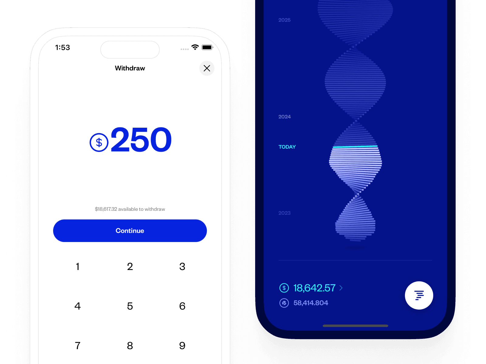
Designing the Eco App
Creating a zero to one fintech product
Eco
2021-2023
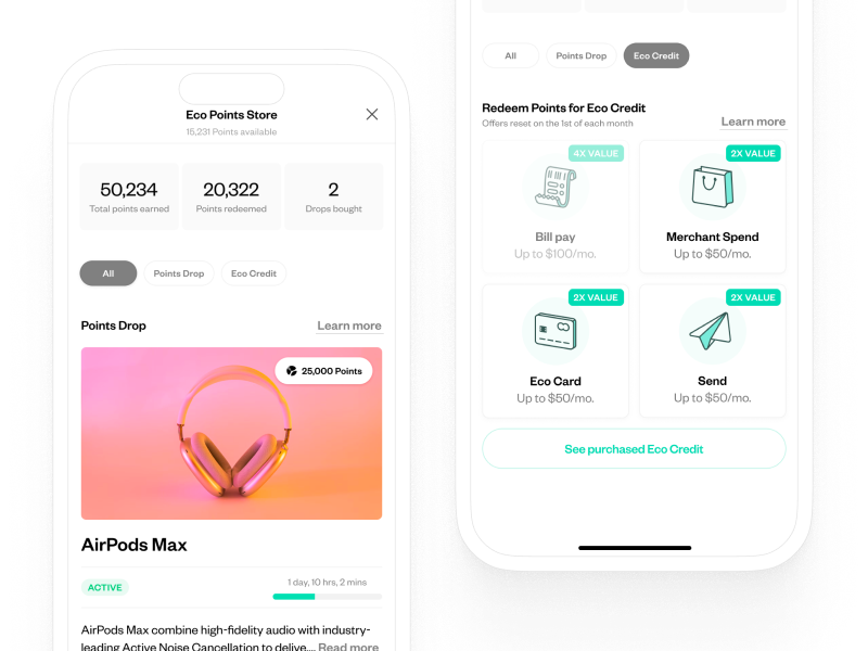
Eco Points Store
Closing the loop on Eco Points
Eco
2023
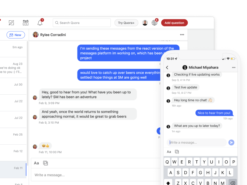
Quora Messages
Improving a complex multiplatform communication tool
Quora
2021
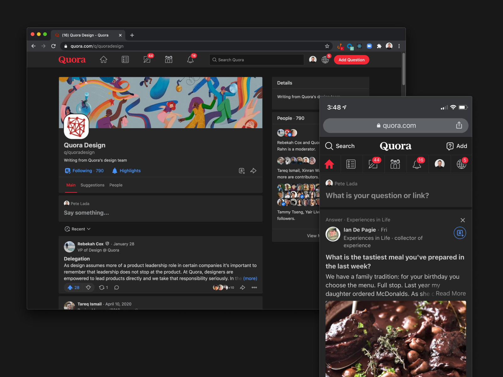
Quora Dark Mode
Adding themeability to a massive consumer platform
Quora
2020
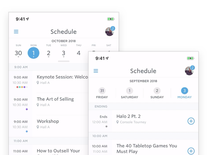
Guidebook Schedule Redesign
Improving a feature used by millions
Guidebook
2019
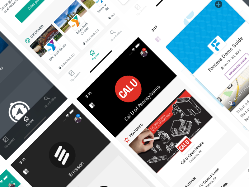
Guidebook Spaces
Adding a new layer to the Guidebook platform
Guidebook
2018