
I'm Pete Lada, a product design generalist.
I'm currently a product designer at Previously, I was a staff product designer at Eco, a design lead at Quora, and co-founded and led product design at Guidebook, a mobile event guide platform.
Guidebook Spaces
Guidebook Spaces
Adding a new layer to the Guidebook platform
I haven't been involved with Guidebook since 2019, but I think this work is still relevant to my overall experience and thinking.
Summary
A new concept designed for the Guidebook platform allowing for a completely branded, private collection of guides on the Guidebook container app. A challenging project, it was forced upon us after Apple's rule changes for their app store, disallowing templated apps from the same developer. This presented a number of constraints, and an extremely aggressive timeline to keep the company sustainable.
Background
At the end of 2017, Apple surprised developers by implementing a set of new rules for the app store relating to "templated" apps. These apps are ones which have largely the same codebase, but are resubmitted to the app store with slightly different content and branding. Guidebook's apps fall into this category; we produce hundreds of apps per year for individual events and organizations, all of which use largely the same code base.
Apps created from a commercialized template or app generation service will be rejected.
This rule change was poised to have devastating effects on Guidebook. If we couldn't produce standalone branded apps for our clients, our most lucrative portion of the business, it would potentially mean the end of the company.
It became priority-1 for the product and design team to come up with a strategy to save the company and allow for our clients to still produce private, branded experiences using our platform.
Timeline of events
Executive deliberation
When the news hit, it was immediately obvious to the executive team what a drastic effect this could have on the company. We had a few options to pursue:
- contact Apple and argue our case (our apps are not considered spam by any reasonable person)
- Force all of our clients onto the Guidebook container app
- Develop a solution to satisfy 90% of our clients branded app needs, minus the app & Play store listing.
In the end and after much discussion, we decided to move forward with a combination of 2 and 3. It was up to the product and design team to figure out what that solution would actually look like.
Product ideation
The design and product teams created a war room within Guidebook to solve the issue. We sat down and brainstormed for hours on how to solve the issue both technically and platform-aware: whatever we designed needed to fit into our existing platform experience. Many questions needed to be answered:
- Should we move branding to the guide level? Should individual guides have their own branding and color scheme?
- Can we develop software to allow clients to submit apps under their own developer account, but using our CMS?
- Should we co-op our guide categories to make listing pages for organizations?
- Can we effectively handle school-based guides and event-based guides on the same container app? Should we have a container app per vertical?
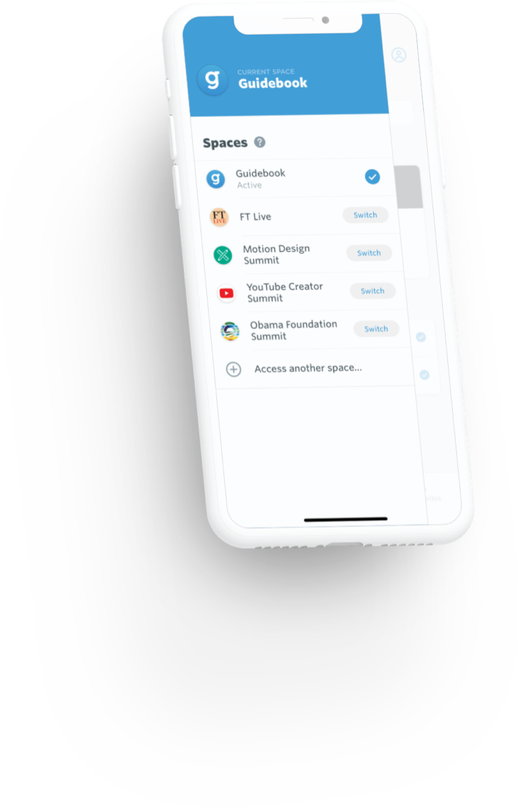
After much discussion both internally and with impacted clients, we decided to introduce a new concept to the Guidebook platform: Spaces.
Spaces would be a layer between app and guide. One app could have multiple Spaces. One Space could have multiple guides. Branding would live at the Space level. A user would only be able to have a single Space open at once, with the ability to context switch between Spaces.
Spaces allowed for us to continue to offer our clients a private, siloed guide experience within their branding, but accessed through the Guidebook container app. This would provide them with nearly everything they had access to with a standalone app, except for the actual listing and presence in the app and Play stores (though at this point Google had no rule preventing us from submitting our standalone apps).
Design explorations
The design ideation process for Spaces was wide-ranging and messy. Once we had a grasp on the concept we wanted to introduce, it was my responsibility to figure out how that concept would manifest itself within our UI. There were a number of challenges which were immediately obvious:
- How would a user onboard into a new Space? Many of our users are not technically savvy and the concept may feel foreign.
- How would you quickly switch between multiple Spaces?
- Would you need to create a new account per Space, or would your account live "above" the Space level? What about SSO gated guides?
- How would you find guides from one Space when you are within another?
- How would theming work?
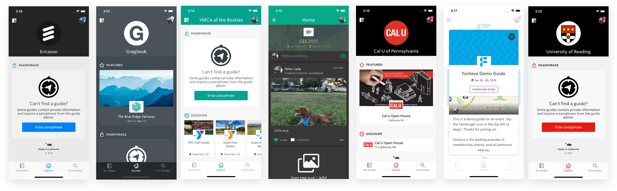
Of the primary challenges, the hardest and most important to solve was ensuring that finding a specific guide was simple. We already had numerous ways users could access guides (redemption codes, invite-only, search, scan, etc) - adding a new barrier to download would surely increase confusion. Additionally, clients wouldn't want other Space's guides appearing in their Space when you search. It was a challenge.
Two examples of some prototypes developed for the product team around onboarding. These were the actual files shared with the team at the time.
An onboarding exploration using a card layout (has audio).
An onboarding exploration using a carousel (has audio).
An onboarding exploration detailing carousel animations as well as different ways to access a guide and Space.
I produced numerous prototypes, each quite elaborate, to walk through various solutions to the onboarding problem. We explored different sections of the app accessed during onboarding (public guides, school-based guides, organization-based guides). We explored gating guides exclusively behind a team or organization. We explored using redemption codes for everything - no public search. I would walk our product team through these prototypes often using videos and voice over. We walked through the initial experience with members of the sales and CSA teams, to gather valuable user feedback. Eventually, we were able to settle on an onboarding flow and app structure that made sense.
Solving for themes
Theming was technically a very challenging problem to solve. Thankfully, given that we already produced standalone apps, we already had a system set up to pull theme colors and color the apps at build time. The issue was that we now had to allow every UI element in the app to theme itself at run time, which was something we had never yet explored. This was especially challenging on Android with how that platform handles styles - run time changes are not straightforward. Thankfully we had talented engineers on both our iOS and Android teams who were able to create solutions for run time theming.
Another challenge with theming was allowing them to be user-generated. We wanted to allow power users to theme elements down to the keyline color, but provide a straight-forward interface for others. We ended up creating a system where a set of 5 base colors would generate a theme for the entire UI. The system would dynamically select colors based on the brightness of others, ensuring UI elements would always be visible within their context. More advanced users could opt to disable the theme generation and instead input their own colors at the micro-UI level.
The solution
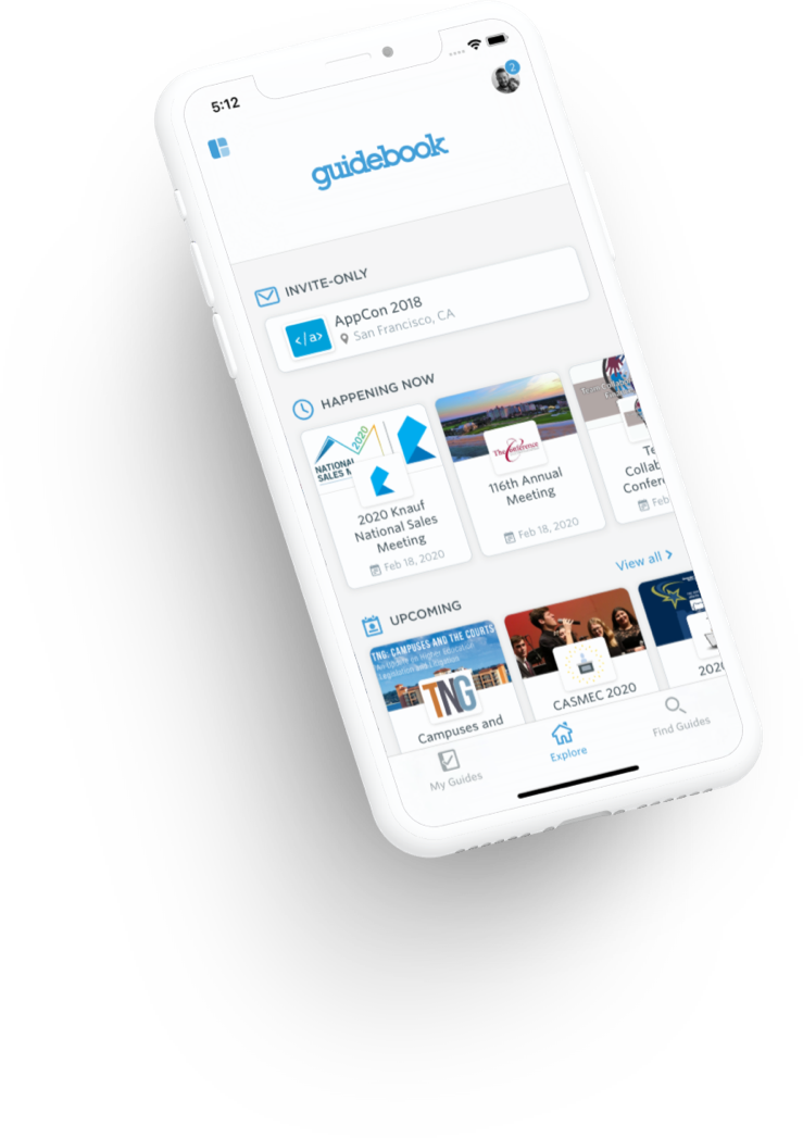
Our final solution for Spaces ended up taking a much simper approach than we initially conceptualized. The onboarding flow would give users an overview of what Guidebook is, while directing them to either search for a guide or enter a redemption code. By default, users would be a member of the Guidebook Space - the public Space which houses all public guides.
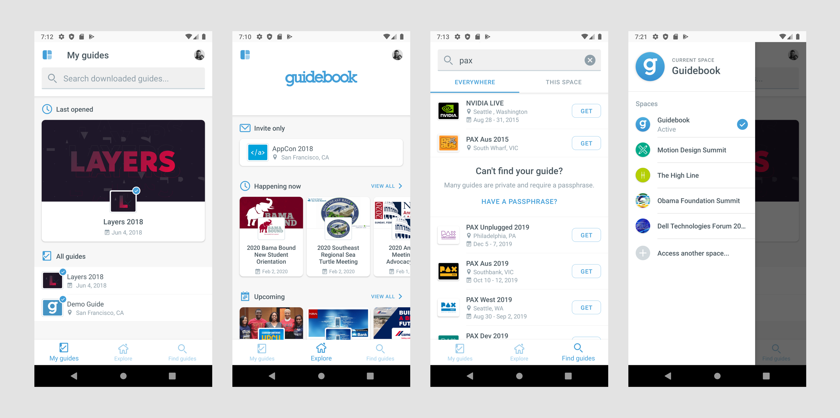
Guidebook's default Space on Android. Showing "My Guides", "Explore", "Search", and the Spaces drawer.
When searching for a guide either from the onboarding or from the Guidebook Space, we would surface guides which belonged to other Spaces - thus allowing for easy guide discovery. If you attempted to access a guide from the Guidebook space which was a member of another, you would automatically be taken to that Space first. Any non-Guidebook Space would only surface its own guides during search. Redemption codes were still the preferred way to access guides, as they would take the user directly to the guide in question, regardless of current context.
An example flow from initial app onboarding to downloading a guide via passphrase, then accessing a separate Space via search.
Conclusion
While I do wish we had more time to spend on the project—the entire process felt quite rushed due to the time constraint—I think the end result accomplished our immediate needs. We had many clients switch from their branded app to using a Space, which was the primary metric we were using to gauge success for this project. The company didn't end up churning a higher-than-normal number of clients, which again pointed to the success of this project.
Once Spaces launched, we were able to develop a second solution to the App Store rejection problem where we would submit apps under a client's Apple developer account using our Assembler product. While this process was still quite manual and labor intensive, it was able to save clients who absolutely needed their own branded app.
In the end, a crisis was averted and the company was able to continue operating, much due to the success of Spaces.