
I'm Pete Lada, a product design generalist.
I'm currently a product designer at Previously, I was a staff product designer at Eco, a design lead at Quora, and co-founded and led product design at Guidebook, a mobile event guide platform.
Designing and developing the Eco App
Designing and developing the Eco App
Creating a zero to one fintech product
Summary
EcoEco is a web3 fintech company whos primary goal is to develop and popularize a new currency built on top of Ethereum called ECO and its sister token ECOx. You can learn more about the currency at eco.org (which I also designed). launched the first version of their app in 2020 after raising a funding round from a16z and others. The initial version of the Eco app was a true MVP, proving out the idea that a banking system where the incetives of the company align with incentives of the users could work.
The MVP version of the product was a React Native app, and was designed and built rapidly by a more junior team. It worked, but the product experience was lacking. I was brought in to help reimagine the product experience and rebuild the product as a polished, native, SwiftUI app.
There is too much to cover in a single post, so I'll focus below on some specific design details and my involvement.
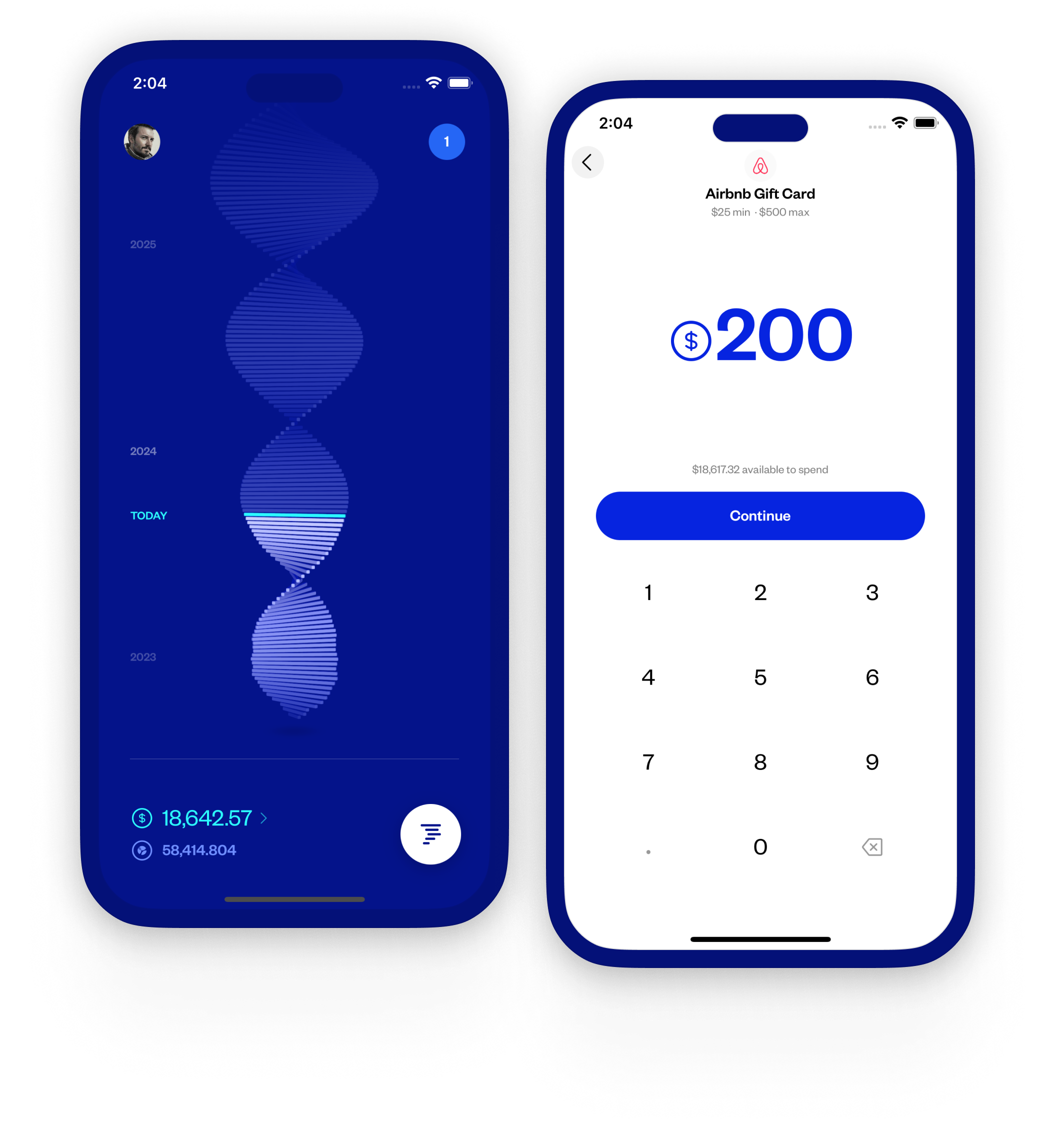
The Helix
Before I joined, there was some conceptual design work done by Work & Co., specifically around the helix and app navigation. The helix is a concept unique to Eco, a 3D artifact which serves as the home screen to the product, meant to represent your financial growth over time. You can think of it as a vertical bar chart where each bar represents your relative wealth at that point in time. The solid bars were historical balances, while the faded out bars were a projection into the future.
I took this concept and designed most of the experience around the helix, including animations, display logic, interactions, and more. I also implemented a lot of this in Swift myself. For instance, the pull to refresh animation and the various "success animations" were built by me. This involved learning quite a bit about SceneKit (iOS' 3D renderer), particle systems, and more.
The helix served as the user's home view. I spent a lot of time getting the transitions between the helix and neighboring views feel seamless.
I was particularly fond of the pull to refresh animation I created here, both in the interaction design and the 'ripple' effect while refreshing.
New user experience (NUX)
During one of our hackathons, I conceptualized and built a lightweight new user experience (NUX) for Eco. We took my work from the hackathon and turned it into a full-fledged feature. NUX became a core part of the Eco product experience, with most new features feeding back into the system in some way.
NUX ultimately was a successful launch. It allowed us to drop a number of required steps during onboarding and move them to a post-sign up experience, increasing our deposit conversion rate. In fact, prior to launch our deposit rate was 2%. Post launch this increased to 10%, and continued to trend upwards (to near 17% - for context, the industry standard is around 10%).
Additional data: Plaid linking (a key metric) went from 23% pre-launch to ~40% post-launch. Similarly, sign ups for an "Eco Concierge" session (think: a guided onboarding by someone from Eco) went from 3.6% pre-launch, to 10% post.
Deposit rate post-launch +8%.
Bank-link rate post-launch +17%.
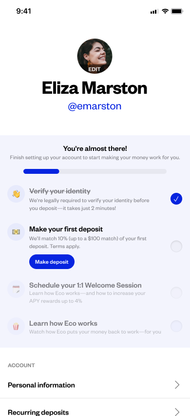
NUX was primarily completed through a user's profile view. Items could be completed inline, without needing to manually navigate back to the profile upon completion.
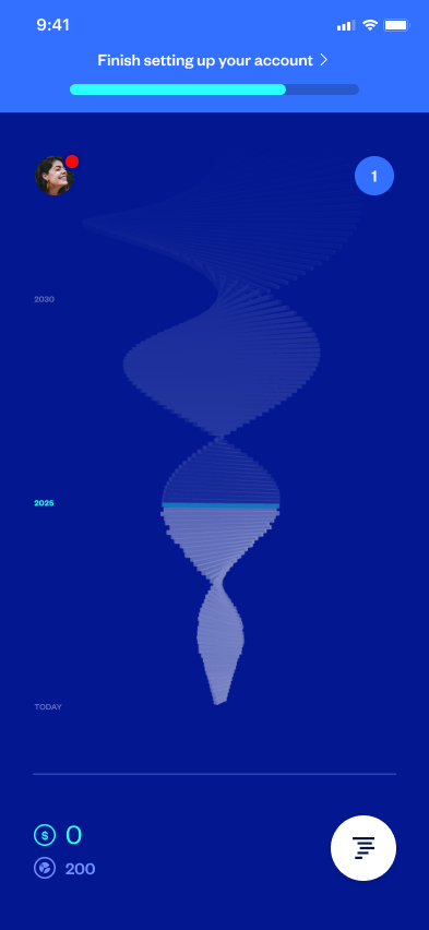
New users would be presented with a NUX entry point on their home view. This aggressive treatment drove most of our NUX engagement.
P2P
I designed the experience for a peer-to-peer, Venmo-like feature where you could send either USD or Eco Points to other Eco users, or people off the platform. The feature was designed to both get us closer to bank parity while also being a growth channel.
If a user sent funds to someone not on the platform, they'd be taken through a unique onboarding experience where we'd dangle the pending funds as a carrot to complete sign up. We saw a lot of success with this referral mechanism.
In the two months after launch, we saw a 2x increase in MAU.
The flow for sending Points to another user on Eco.
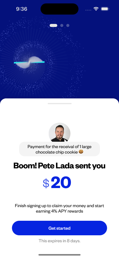
If you sent to someone who was not on Eco, they would be presented with a personalized onboarding which included their pending funds as an incentive to complete sign up.
Eco Card
I designed the visual components for Eco's initial and follow up debit cards, in addition to the card experience in the app itself. To reflect on various physical card designs, I created a 3D viewer in three.js to get a better sense of the presence of each design.
The initial card design was meant to reflect Eco's ethos at that point in time: still at the R&D stage, scrappy, early, etc. The second card design was meant to be more elegant, evergreen, and minimal - it was also printed on a metal card with a matte finish, giving it a premium feel.
The card viewer I built to preview the various Eco Card designs I made. View it here (desktop only).
Eco Points Store
I designed a Points Store experience in app where users could redeem the Eco Points they accrue for things like Eco Credit and "prestige" goods (Apple AirPods Max, etc).
+21% MAU after launch
+212% App Installs in the week immediately following release
Generated 4.5x the support traffic (generally can be abstracted to product engagement).
Read the Full case study on this project.
Purchasing a Drop in the Points Store. Drops occured once every two weeks.
Viewing your available Eco Credit. Credit would be applied towards future purchases on Eco.
Marketing site
When we moved the app to use a traditional USD backend, we also spent a few cycles creating a new marketing site to better demonstrate the product. This included dramatically simpling the pitch, both in terms of language and presentation. The site was essentially a single page, with a clear call to action. The site converted dramatically better than the previous incarnation.
I designed, built, and deployed the site. I was especially proud of the various "build-in" animations I constructed, entirely in JS/CSS.
A scrollthrough of the homepage for the Eco App. I designed, built, and deployed the site (nextjs/vercel).