
I'm Pete Lada, a product design generalist.
I'm currently a product designer at Previously, I was a staff product designer at Eco, a design lead at Quora, and co-founded and led product design at Guidebook, a mobile event guide platform.
Guidebook Schedule Redesign
Guidebook Schedule Redesign
Improving a feature used by millions
I haven't been involved with Guidebook since 2019, but I think this work is still relevant to my overall experience and thinking.
Summary
An overhaul of Guidebook's schedule feature - the platform's most popular feature and a key differentiator for the product. The redesign targeted improvements to the schedule's date picker, filtering method, and general user experience.
Background
The Guidebook platform developed essentially as a collection of tools surrounding its primary feature: the schedule. Starting as an events-specific product, the schedule was the true catalyst for app usage - without one there would be little purpose to use the app. Additionally, Guidebook has achieved and maintained success within the event-app space by focusing and relentlessly iterating on the end-user experience of the app. With that in mind, in 2019 I took it upon myself to overhaul the schedule module, and to convince the executive team to approve the project.
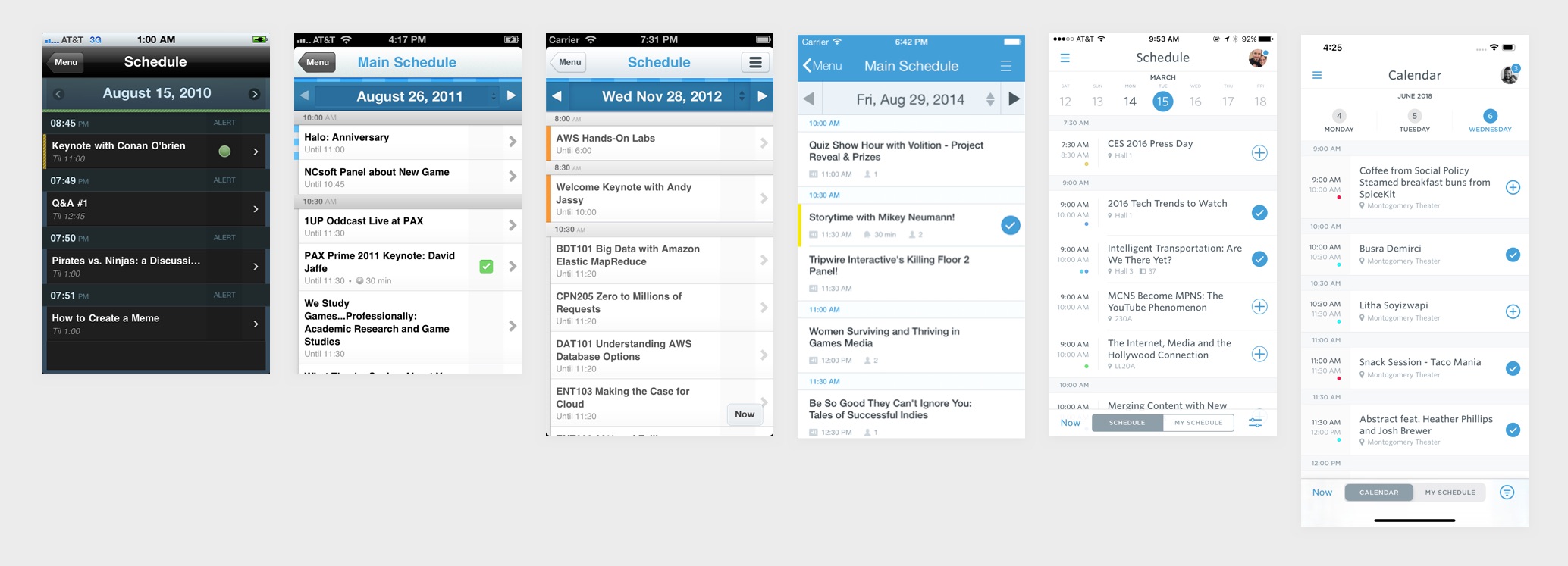
The schedule module has evolved and refined over 10 years. The right-most figure is after the schedule redesign.
Goals
- Improve the general user experience. While the schedule was relatively easy to use, I wanted to make it more delightful, engaging, and fun, as well as tap into some newer design paradigms (i.e. a page sheet).
- Simplify date navigation. Given that Guidebook supports a wide range of guide durations, we should adjust the date picker to render in an optimal way based on the guide's specific length.
- Improve filtering behavior. We want to make filtering by track easier and more intuitive.
- Update schedule/my schedule toggle design. Current design is fragile and confusing.
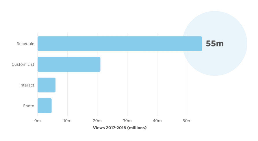
An internal chart showing the popularity of the schedule module relative to other features.
Specific improvements
Adaptive Date Picker
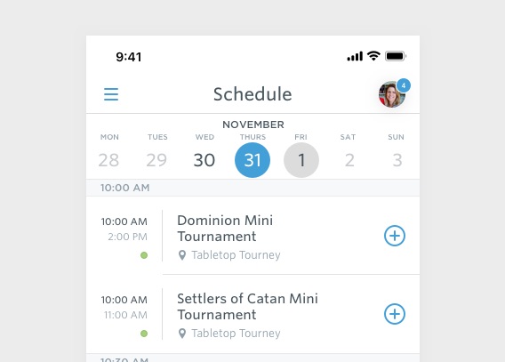
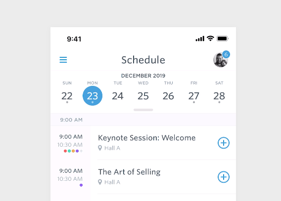
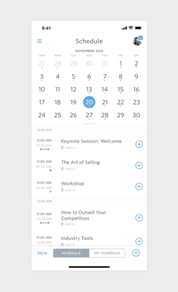
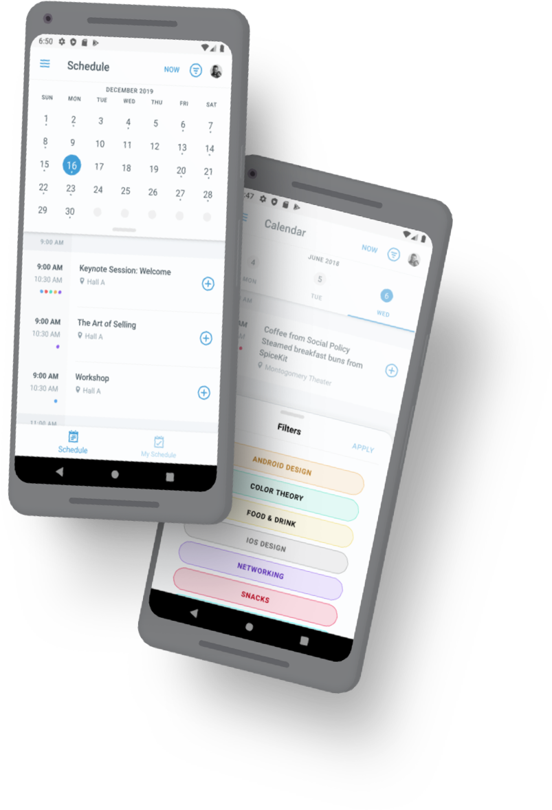
Guidebook supports guides ranging from a single day to year-round. Given this, it became apparent that the date picker needed to adjust based on the duration of the guide. I proposed introducing four states to the date picker: single-day, short, medium, and on-going.
Single-day event
When the date picker is in the "single day" state, it will present itself not as a picker, but as a rendering of the day the guide occurs on. The user can no longer adjust the date selected.
Short event
When the date picker is in the "short" state (2-4 days), it will present itself as a simple picker, which no ability to swipe to the next or previous week. It will not render days outside the bounds of the guide's duration.
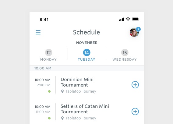
Medium-length event
When the date picker is in the "medium" state (5-14 days), it will present itself as a date picker which is interactive (you can swipe to the next or previous week). Days outside the duration are not selectable.
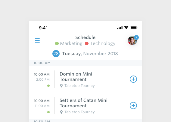
Ongoing event
When the date picker is in the "on-going" state (no start or end date, or longer than 2 weeks), it will present it as a fully functional calendar. It can be expanded from week to calendar view, and any day can be selected (displaying "no sessions" if nothing occurs on that day). We also display "dots" on days which have sessions.
Better filtering UX
To make filtering more obvious and intuitive, we replaced the popover with a full bottom sheet. This sheet can be dragged up to expand the full list of filters, with clear indications for which filter is applied.
We surfaced the applied filters in the navigation bar, so the user is aware of what filter is applied at any moment.
Schedule toggle improvements
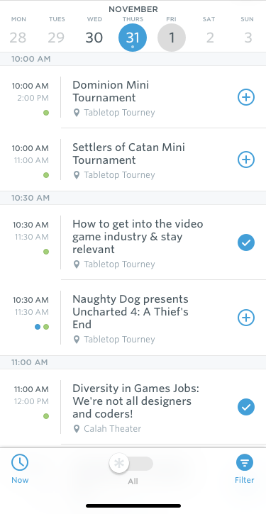
To reduce confusion with the schedule/my schedule toggle (as well as remove the labels as they often became truncated) I proposed moving to a check mark motif. This both matched the motif we use in the schedule rows themselves, but also saved room in the footer so that the labels no longer truncated. This would more clearly operate as a higher level filter as well, rather than paging between two separate views.
Process
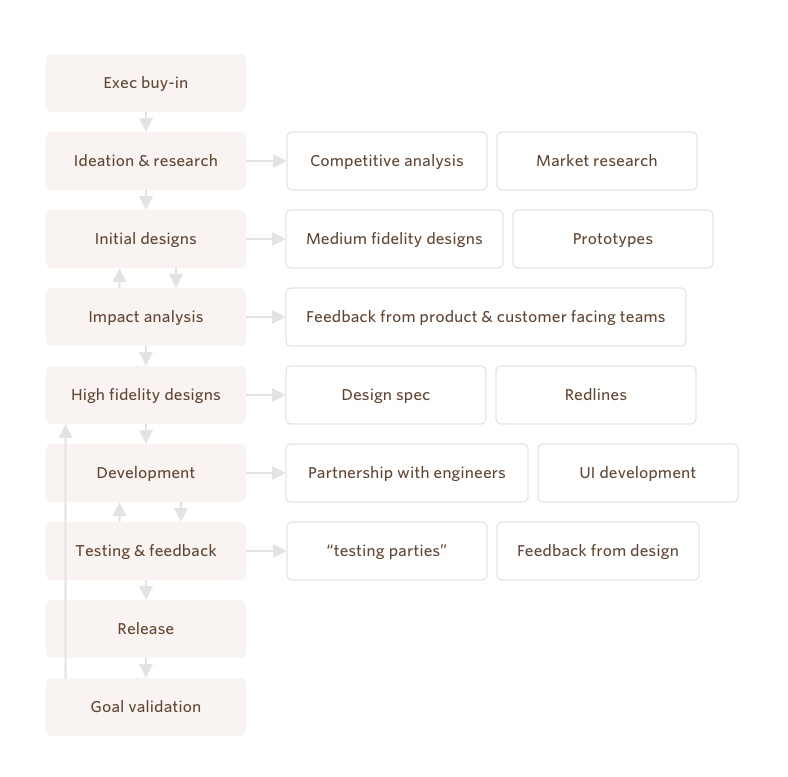
The process taken for this project. This is generally the design process I would follow while at Guidebook, with small tweaks per project.
Executive & Product Buy-in
Once I decided that the schedule module needed an overhaul, it became important to convince the product and executive teams that it was a worthwhile endeavor. This was a relatively simple process which started with the creation of a one-page product pitch document. This document explained the goals of the project, a business case, and an estimated scope. I presented this document to the product team, and was able to convince them to add it to a list of projects under consideration. Next, I presented the one-pager to the executive team in our monthly product/exec meeting. It got buy in from the rest of the executives, and was formally slotted into the roadmap.
Ideation & Research
I had a rough idea of what I wanted to improve, but wanted to validate those ideas with other, customer-facing teams. I sat down with both the CSA and sales team leaders to discuss the biggest issues they hear from customers relating to the schedule module. These complaints aligned fairly closely with what I had anticipated: difficulty with day selection and some confusion around filtering.
I did a lot of research on how other apps handle scheduling. Our use-case is fairly specialized (bounded events) but it was useful to gather interaction inspiration from such apps as Outlook, Google Calendar, Google I/O's event app, Sunrise, among others.
Next, I started producing some rough designs of how we could improve the feature. I had a fairly clear idea of what I wanted to create, but still explored here, mainly around the layout for the filter sheet.
Prototyping
From the designs, I created prototypes of nearly every new interaction encompassed by the redesign. I feel very strongly about prototyping and try to incorporate it into every project I work on. I ran these prototypes by product as well as members of the sales and CSA teams to gather feedback. They helped better communicate how the filter, picker, and other UI elements would behave. Some are shown below.
We did some user testing here as well, having non-technical members of our team play around with the prototypes to provide feedback.
A Framer prototype I created for the Android filter bottom sheet.
A Framer prototype I created for the Android schedule header scroll collapse behavior.
A Framer prototype I created to test various filter pill colors in both selected and default state.
A Framer prototype I created showing the behavior of the collapsed week/day picker on iOS.
Impact Analysis
Once the designs and prototypes were fairly well established, I constructed an impact analysis with one of our product managers. This analysis contained near-final designs and interactions. These were presented to team leads for any final feedback.
Development & implementation
Finally, development began. I worked closely with our primary iOS and Android engineers to implement the new designs. Often, they would set up a view and then pass it over to me to tweak and polish. This process of design/developer back and forth within the actual codebase is something I have done for years and find results in quality products.
Testing & release
Next, with the QA team I set up a "testing party" for the feature. I worked with our QA lead to produce a set of criteria and requirements which had to pass to consider the feature release-ready. We sat down with PMs and other developers to complete the tests. Once passed, we cut a release candidate for both apps.
Validating goals
After release, we primarily tracked if the feature was successful through customer feedback. Our net promotor score was something we kept an eye on. I had some of our account managers discuss the changes with customers to gather feedback, most of which was positive. We closely tracked metrics on schedule usage (schedule views, schedule item adds, etc) to make sure there were no negative effects, which did not materialize.
Iteration
As with any major project, after release inevitably bugs are found or edge cases are unearthed. We continued to iterate on the feature, adjusting things like how single track schedules operate. The schedule is the type of feature which will never be "done" at Guidebook, and I envision iteration and evolution here will continue for the next 10 years, as it has for the previous.