Building the Eco Points Store
Building the Eco Points Store
"Closing the loop" on Eco Points

Summary
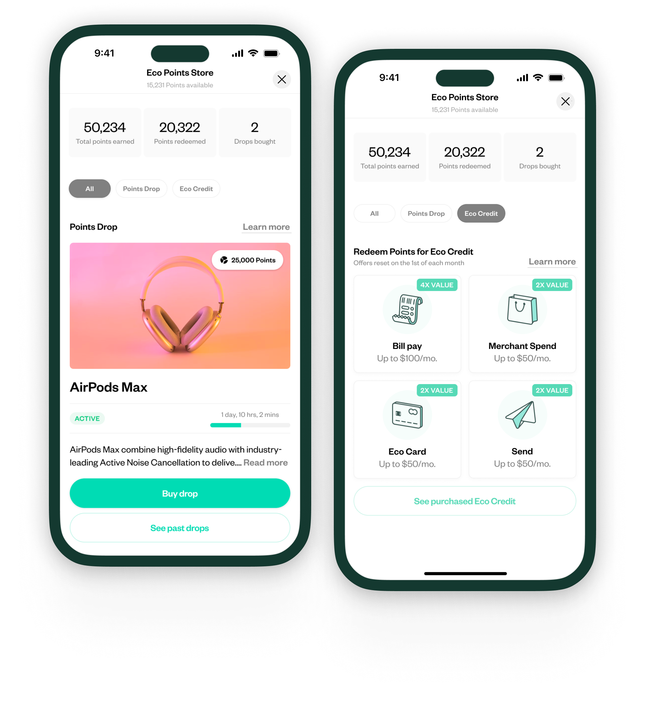
I pushed for prioritization and designed the Eco Points Store, where Eco users can spend the points they earn on the platform.
Background
To address churn and growth challenges, we conducted user research to determine where Eco as a product was falling short. The ability to derive value from Eco Points was frequently cited. I pushed the executive team to prioritize the ability to spend Eco Points in product, and designed the experience for two programs: Point Drops and Eco Credit.

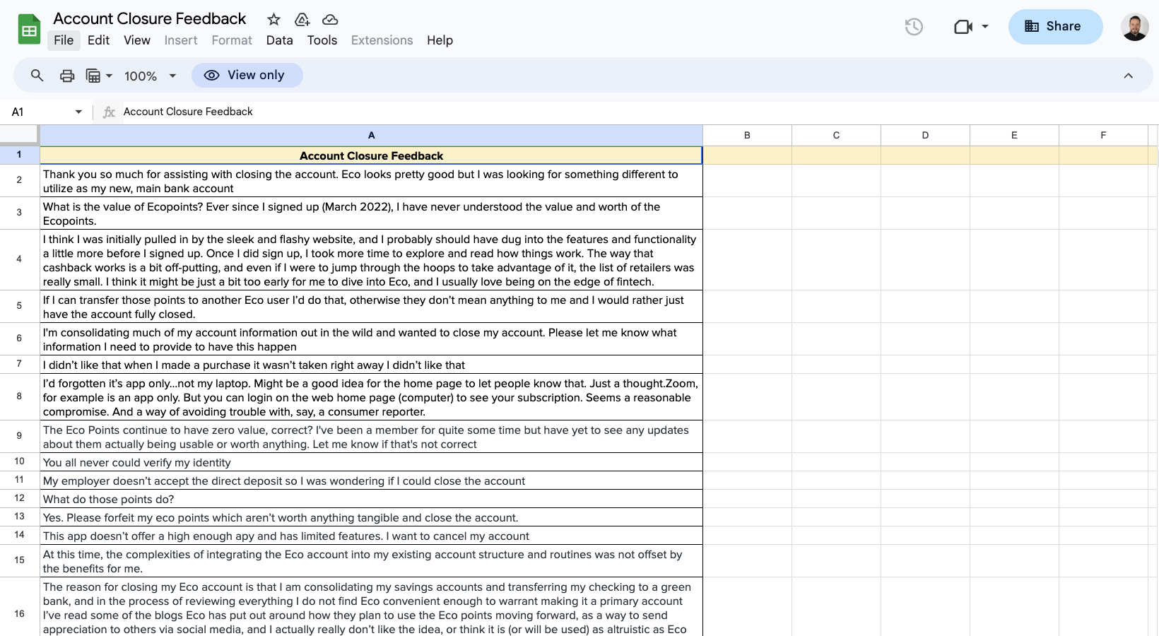
A sampling of feedback we gathered from user studies. In this batch, nearly 50% cited Eco Points (lack of) value as the reason they churned.
Getting buy-in
Since joining Eco, I felt strongly about introducing a way to spend points as soon as possible. Intuitively, it felt like a missing piece of the experience - users would accumulate points on the platform for various actions, but had no ability to redeem them in a meaningful way. We played around the edges, but never allocated resources to the initiative, instead focusing on features to reach bank-parity.
After conducting a series of research studies to address churn and growth concerns, we learned the lack of point spend programs was becoming increasingly problematic. Users wanted a way to spend the Points they were accruing — trust in Eco was in jeopardy.
Proactively, I put together a set of rough designs on a point store experience and pitched the programs to the executive team via a series of Loom recordings (example). Ultimately, the user research results combined with my product direction was enough to give our team the green light to devote resources to the problem.
Point-spend programs
We took my initial concepts and pared them down to two initial programs: Points Drops and Eco Credit. We felt this was broad enough for an MVP, while being scoped narrowly enough to execute on quickly. They also had the benefit of each addressing a pillar of one of Eco's core philosophies: "head in the clouds, feet on the ground". Drops were meant to be aspirational and magical ("head in the clouds") while credit was meant to be grounded and utilitarian ("feet on the ground").
Points Drops
Points Drops is a program where a luxary, rare, or otherwise compelling item (think AirPods Max, Taylor Swift tickets, etc) is "dropped" at a regular cadence. The quantity is limited, but the "exchange rate" of Points to USD is far and away the highest on the platform. The program is designed to drive urgency and virality to the platform — "what is the drop this week?", "should I buy this drop, or wait for the next?", "I need to tell people about this" — and gamify the point-spend experience in a unique way.
I think of it as a modern twist on Woot.
The purchase flow for a drop. I designed and built a bunch of custom interactions and animations for this flow.

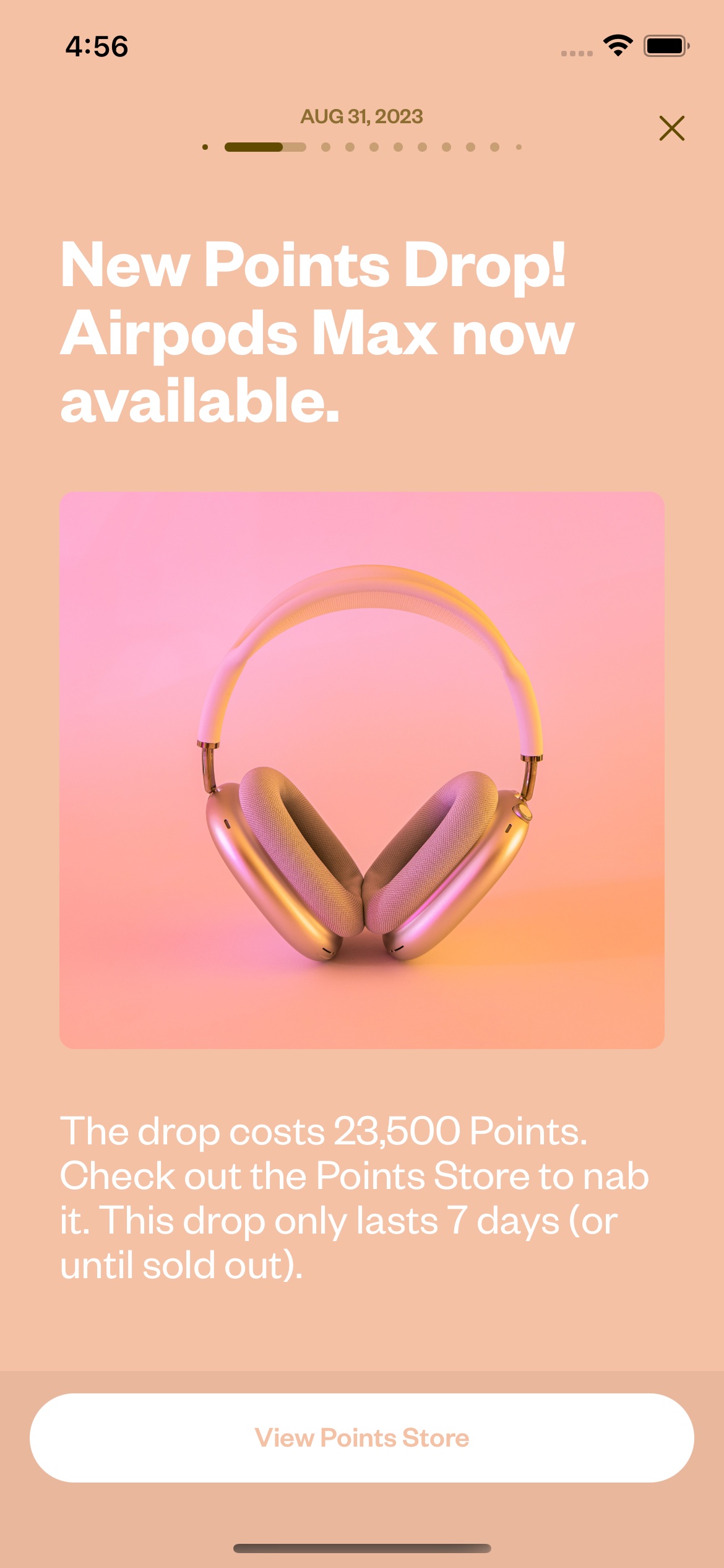
We created a story for each new drop. The user would also be notified via email and push notif.
Eco Credit
Credit, in contrast to Drops, is meant to be much more utilitarian and predictable. This program wraps the ability to sell your points for USD in a layer which encourages additional transacting on the product. Instead of directly selling Points, you instead buy credit towards future transactions on Eco. Once transacted, you earn a rebate directly into your Eco account of the amount spent. This program is meant to be a reliable, evergreen way to spend your Points - the trade off being a lower exchange rate. Wrapping the program in future transactions creates a compounding effect on engagement: spending Points requires transacting, transacting earns more Points.
The primary entry point into the Credit summary view is via a user's dashboard.
Credit can "sell out" each month. This gives Eco some protection and prevents mass points liquidation.
Purchasing credit is a simple flow, deducting Points from a user's total Point balance.
Credit is represented in the UI with a purple treatment, and the credit icon. I wanted it to be clear in the UI when credit was applicable to a given interaction.
Driving adoption
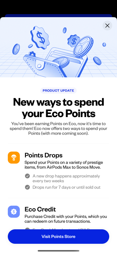
To make new and existing users aware of the program, we implemented a series of promotional items which I designed. We sent out a series of emails leading up to launch (example below) and introduced a new promotional app-launch sheet. We also sent a story (Eco's version of an interactive notification) to all users for the first drop, as well as a video story promoting the program in general.

A promotional sheet we'd show to new and existing users when they entered Eco post-launch.
One of the promotional emails we sent for the Points Store launch. I also built and designed Eco's entire email system.
Results
As of writing, the Points store is still brand new, having been released only 2 weeks prior. Early signals are extremely positive though, and solidify our decision to put time and development effort into the launch. Some early results:
+21% MAU after launch
+212% App Installs in the week immediately following release
Generated 4.5x the support traffic (generally can be abstracted to product engagement).
