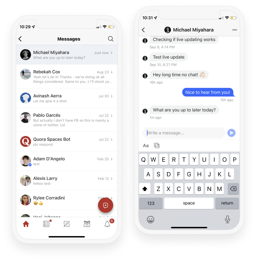
Quora Messages Redesign
Quora Messages Redesign
Improving a complex multiplatform communication tool

Summary
I redesigned Quora's messaging system and helped implement the front end in React.
Background
Midway through Quora's React migration, I was asked to lead design on migrating the messages product from Webnode (Quora's proprietary front-end framework) to React. While messaging is not a core feature of Quora, it is quite heavily used, with nearly 10 million messages sent per week.
Initially, the goal was simply to migrate the messages product in its current form, without any changes to behavior or functionality. When I joined the project, I pushed hard to use this as an opportunity to overhaul the messages feature - bringing it closer to parity with other major social internet products.

Old Quora messages vs. the new redesign.
Specific problem areas
- There was no dedicated messaging page on desktop. Messages always opened in an overlay, which provided easy access but made navigating the messages system as a power user frustrating.
- The messages inbox was a separate view from the message thread on desktop. This made navigating between threads more frictional than needed.
- Generally, performance was pretty poor. Sending a message would send a full page reload. Some of this would be improved “automatically” with React, but there was room to make our message system feel more native.
- The UI felt relatively outdated.
Ultimately, I was successful in convincing leadership that an overhaul was necessary. I worked with a small team of engineers to fix the issues mentioned above, and implement a smoother, more responsive messaging system. This included moving messages to its own dedicated page on desktop, including a two-column inbox system. We added a messages dock on desktop as well, which persisted on every page, to continue to allow the quick ease of access which the overlay previously provided. We introduced live-updating of message threads, so sending and receiving messages didn’t require a full page refresh.
The desktop messages dock in use.
Results
Results were positive, particularly on desktop where the bulk of changes were made. We saw messages sent increase by 20% on desktop during the initial migration, and another 20% when we introduced the dock (the dock also increased messages thread started by ~30%). The screenshots below are taken from Scientist, Quora's internal experiment analysis tool.

Results from the initial React migration + redesign.

Results from the subsequent desktop messages dock experiment.
In the end, this was a successful migration which resulted in an opportunity to modernize a non-mission-critical feature, in which design played a key role in both pushing for change and leading implementation.
